Something New
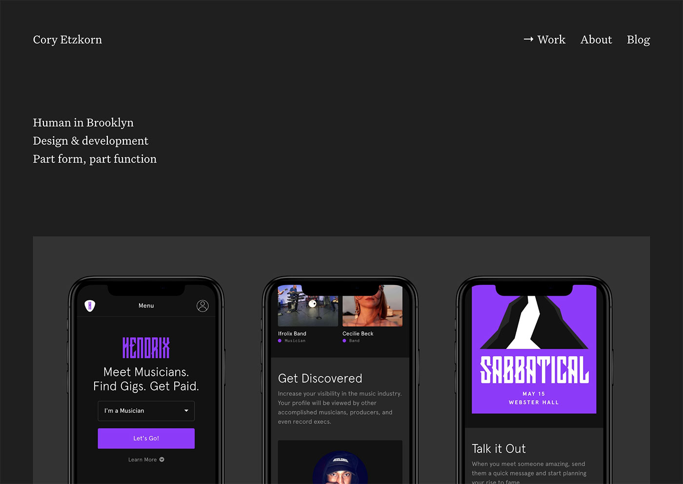
I have a new site!
It’s been almost three years since the last update. A refresh was certainly in order. My goals for the redesign included:
- More robust case studies and storytelling capabilities
- A blog section with great typography
- Make it easier to share shorter notes and snippets in addition to long-form content.
- Full HD image support
- Lightning-fast load times
- One-step deployment
- Bring back RSS
Under The Hood
I like to use my personal site as a testing ground for new technologies. This update includes quite a few! Here’s a quick rundown of the tech powering this site.
- No more floats (thank you flexbox)
- Retina images via srcset
- Static CMS (Jekyll)
- Continuous Deployment (Netlify)
- RSS
No More Floats!
You won’t find a single display: float; in this codebase. All layout is handled by either flexbox or the CSS grid property. Browser support for flexbox is almost universal at this point, so I decided to jump in.
The entire grid system is only 55 lines of code! I’ve used this same grid system for almost every site I’ve launched over the past 5 years (floats now swapped for flexbox).
It’s super flexible. You can either use atomic helper classes such as .row or .col .col--one-half or you can build your own column sizes on the fly with the column mixin. For example, @include column(2,12) would create a column that spans 2 of 12 total columns, all with 40px gutter (defined by $gutter).
This grid system was originally inspired by Chris Coyier’s Don’t Overthink It Grids – still one of my favorite and most referenced blog posts of all time. No bloated foundation or bootstrap here!
$gutter: 40px;
@mixin column($col, $cols) {
  flex-basis: (($col / $cols) * 100%);
  max-width: (($col / $cols) * 100%);
  padding: 0 ($gutter / 2);
}
@mixin row() {
  display: flex;
  flex: 0 1 auto;
  flex-direction: row;
  flex-wrap: wrap;
  margin-right: -($gutter / 2);
  margin-left: -($gutter / 2);
}
.row {
  @include bp(m) {
    @include row;
  }
}
.col {
  margin-top: $gutter / 2;
  @include bp(m) {
    margin-top: 0;
  }
  &--one-third {
    @include bp(m) {
      @include column(1, 3);
    }
  }
  &--one-quarter {
    @include bp(m) {
      @include column(1, 4);
    }
  }
  &--one-half {
    @include bp(m) {
      @include column(1, 2);
    }
  }
  &--two-thirds {
    @include bp(m) {
      @include column(2, 3);
    }
  }
  &--three-quarters {
    @include bp(m) {
      @include column(3, 4);
    }
  }
  &--full {
    @include bp(m) {
      @include column(1, 1);
    }
  }
}
I should note that this grid is also reliant on a breakpoint (bp) mixin:
$breakpoints: (
  xs: (
    min-width: 500px,
  ),
  s: (
    min-width: 800px,
  ),
  m: (
    min-width: 920px,
  ),
  l: (
    min-width: 1200px,
  ),
  xl: (
    min-width: 1400px,
  ),
);
@mixin bp($name) {
  $value: map-get($breakpoints, $name);
  @if map-has-key($breakpoints, $name) {
    @media #{inspect(map-get($breakpoints, $name))} {
      @content;
    }
  } @else {
    @warn "The "#{$name}" breakpoint is not defined. " + "Please make sure it is defined in the global.scss "$breakpoint" map.";
  }
}
Retina Images via srcset
My previous site served only retina images. That worked and was easy to implement. All I had to do was 2x all the images. The obvious downside of that approach was that I was serving massive images to non-retina screens and mobile phones that didn’t need them. Since performance was a primary objective for my new site, I had to find a better way.
The srcset attribute is currently the most widely supported and practical way to implement retina images. The src attribute also acts as a natural fallback for unsupported browsers. Easy!
Figuring out the proper way to implement srcset ended up taking a solid afternoon. The tag so simple because the browser is handling most of the complex calculations behind the scenes, which is great, but the secret math is hard to wrap your head around.
I started with this approach:
<img
  src="hendrix-hero.jpg"
  srcset="hendrix-hero.jpg, hendrix-hero@2x.jpg 2x"
  alt="Hendrix"
/>
This is the most basic implementation. You upload two images, set one as the default, and add a 2x flag to ensure the larger image is served to retina devices.
The problem with this is that tiny (375px) iPhone screens are considered “retina devices”. Thus, they would be served the 2x image. In theory that sounds fine, but let’s do some simple math.
iPhone X width = 375px 2x image width = 2800px 2800 / 375px = 7.46x
This means we’d be serving iPhones images that are 7 times larger than standard screen resolution. iPhone screens are only 3 times higher resolution than a standard screen. We’d effectively be sending twice as much data as needed.
Enter the sizes attribute…
<img
  src="hendrix-hero.jpg"
  srcset="hendrix-hero.jpg 1400w, hendrix-hero@2x.jpg 2800w"
  sizes="(max-width: 500px) 460px, (max-width: 800px) 720px, 1400px"
  alt="Hendrix"
/>
The sizes attribute can be very confusing at first. Here’s a quick breakdown of how it works and interacts with the srcset tag:
srcsetis where you define the available image assets.- Normally these image URLs are accompanied by a 1x or 2x flag to target retina devices.
- If you’re also using the
sizestag, you’ll want to replace the 1x / 2x flags with actual pixel values. - These pixel values should represent the width of the image file itself.
- Traditionally, a browser doesn’t know how big an image is until it is downloaded.
- The
srcsetattribute exists to supplement the browser’s knowledge and tell it how the image will eventually be rendered on the page before the image loads. (max-width: 500px) 460pxis telling the browser this image will be rendered at a maximum size of 460px when the browser viewport is up to 500px wide.(max-width: 800px) 720pxis telling the browser this image will be rendered at a maximum size of 720px when the browser viewport is up to 800px wide.1400pxis telling the browser this image will be rendered at a maximum size of 1400px at all other breakpoints.
At this point we’ve provided the browser enough information to make complex calculations on our behalf. The browser will now take into account three pieces of information when selecting an image to serve: the original images size, the maximum size it will be rendered on the page, and the resolution of the device on which it is being served.
The end result of all this madness? iPhones will now be served the 1x image because it is most appropriate for the display.
iPhone X width = 375px 1x image width = 1400px 1400px / 375px = 3.73x
While the 1x image will ultimately still be too large for iPhones (by a factor of 0.73), it’s much more appropriate than serving a 2x image to such a small screen. Mobile visitors will now see much faster load times without sacrificing any image quality.
Static CMS (Jekyll)
I’m a big fan of static site generators. They’re not the right fit for every project, but they fit my personal workflow perfectly. Jekyll is the tried and true OG static site generator. There are quite a few alternatives now, but Jekyll always gets the job done.
Some reasons I like Jekyll:
- Shopify’s liquid templating language is a dream
- Control via the command line
- Static files = blazing fast load times
- Everything lives in version control
- No databases
- No hacking / security holes
- Large community
- Solid docs
- Host for free on GitHub pages. I don’t do this, but it’s a huge plus!
Jekyll is amazing, but not for everyone or every project. Trying to decide on a CMS? Check out my guide to Choosing The Best CMS.
Continuous Deployment (Netlify)

I’ve been using Jekyll for almost three years now. While it’s wonderful, the deployment process has always been annoying. In Wordpress, I could simply write a post and press publish. In Jekyll, I’d have to commit the post, generate a build of the site, and upload the files manually via FTP or SSH. That wastes a bunch of time and leaves room for user error. Not good.
My original plan was to setup up continuous integration via CodeShip or TravisCI to auto-deploy my site whenever I committed to master. Both options would involve a lot of configuration and moving parts. Both seemed wayyy overkill for a personal site.
I found Netlify at the perfect time – essentially after I’d given up. It was everything I hoped for and more. It works like this:
- You sign up (for free!)
- Connect it to GitHub
- Create a new site and connect it to a GitHub repo
- Whenever you push to master, Netlify builds your site and deploys
That’s all amazing, right!? There’s more. Netlify can also:
- Compress your images
- Serve images via a CDN automatically
- Minify your scripts and styles
- Act as a form endpoint and manage submitted data
- Handle identity / accounts if needed
It’s all too good to be true! If you have a static site, you absolutely need to check this out.
Bring Back RSS
We’ve seen the damage too much centralized data can cause. RSS is a great way to distribute content without a middleman such as Facebook. I’m including it on my site and I hope it starts to make a comeback.
Cheers!
That ended up being a little more in-depth than I was expecting, but I’m excited to share all these new discoveries. I hope some of these techniques will also prove useful for you.