Don’t Fear Empty Divs
I recently stumbled across the following code:
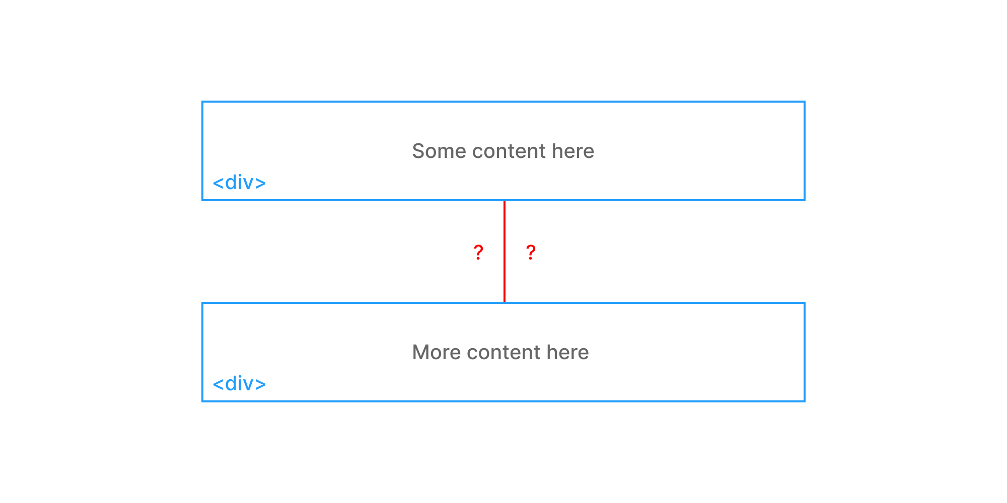
<div>Some content here</div>
<div style="height: 60px;"></div>
<div>More content here</div>
An empty div with a height of 60px surrounded by two divs containing real content.
Rendered, it looks like this:
My first reaction was “Gross! Wrong!”
Conventional wisdom would tell us this is not a semantic way to structure HTML for a few reasons:
- Empty or superfluous DOM elements are generally regarded as bad. They add page weight, can cause accessibility issues, and are generally a hacky solution.
- We have more appropriate tools (CSS
margin-top) to handle spacing like this. - Someone might delete that empty 60px div thinking it serves no purpose.
A more traditional approach would look like this:
<div>Some content here</div>
<div style="margin-top: 60px;">More content here</div>
But then I thought about it some more.
Is an empty div really the end of the world? Is it even bad or wrong? Or have I just been following along and doing what everyone else does?
So I dove deeper into it…
Semantics
Neither approach is very semantic to begin with. We should be using more descriptive HTML5 tags to describe the content. The more-semantic versions would look like this:
<section>
  <p>Some content here</p>
</section>
<div style="height: 60px;"></div>
<section>
  <p>More content here</p>
</section>
And this:
<section>
  <p>Some content here</p>
</section>
<section style="margin-top: 60px;">
  <p>More content here</p>
</section>
With these small changes, both solutions now look perfectly semantic to me. That extra div in #1 doesn’t bug me or break the semantic structure.
Readability
This one is subjective. It really depends on your mental model.
Do you think of space as an independent self-contained entity:
<div>Some content here</div>
<div style="height: 60px;"></div>
<div>More content here</div>
Or as something that exists only in relation to other entities:
<div>Some content here</div>
<div style="margin-top: 60px;">More content here</div>
Which one makes more sense to you? Use that.
Accessibility
We don’t want to confuse screen readers by feeding them a bunch of extra divs and markup, so let’s do some quick testing of the two approaches.
Here’s how the <div style="height: 60px;"> approach sounds:
Your browser does not support the audio element.
And the <div style="margin-top: 60px;"> approach:
Your browser does not support the audio element.
Exactly the same. Great! Turns out that extra div didn’t matter. This won’t always be the case, so it’s important to do your own testing, but it’s good to know an extra element here or there won’t completely derail accessibility efforts.
File Size
This version is 91 bytes (81 bytes g-zipped):
<div>Some content here</div>
<div style="height: 60px;"></div>
<div>More content here</div>
And this version is 83 bytes (77 bytes g-zipped):
<div>Some content here</div>
<div style="margin-top: 60px;">More content here</div>
So we’re talking a difference of 4 bytes. Things can obviously add up, but this difference isn’t something to stress about.
Extensibility
The really cool thing about the less-semantic approach is how it scales. We can go from this:
<div>Some content here</div>
<div style="height: 60px;"></div>
<div>More content here</div>
To this:
<div>Some content here</div>
<div style="height: 60px;"></div>
<div>More content here</div>
<div style="height: 60px;"></div>
<section>
  <img src="image.png" alt="Image" />
  <div style="height: 60px;"></div>
  <img src="image.png" alt="Image" />
</section>
We’ve essentially created a lo-fi spacing component that can be moved around and work in almost any context!
And if you’re using a component-based framework like React (or web components), it gets even better:
<div>Some content here</div>
<spacer />
<div>More content here</div>
<spacer />
<section>
  <img src="image.png" alt="Image" />
  <spacer />
  <img src="image.png" alt="Image" />
</section>
I am a big fan of that syntax! Super readable and extensible.
Further, modern programming languages like Swift actually encourage this pattern:
struct ContentView: View {
  var body: some View {
    VStack(alignment: .leading) {
      Text("Some content here")
      Spacer()
      Text("More content here")
    }
  }
}
Compare this to a more traditional semantic approach where there’s random CSS everywhere and you have to reason between “top” and “bottom” and the infamous collapsing margins:
<div>Some content here</div>
<div style="margin-top: 60px;">More content here</div>
<section style="margin-top: 60px;">
  <img style="margin-bottom: 60px;" src="image.png" alt="Image" />
  <img src="image.png" alt="Image" />
</section>
I definitely find the empty divs more pleasant to work with.
In Conclusion
I could have simply written this code off as invalid or non-semantic:
<div>Some content here</div>
<div style="height: 60px;"></div>
<div>More content here</div>
Instead, I took a moment to think about what the code was actually doing and the potential benefits of this foreign approach.
I’m not here to convince you to stop writing semantic code. Accessibility is critically important and we all need to get better at prioritizing it.
I am here to encourage you to think critically about views and beliefs you’ve held for a long time and be open to changing them. It doesn’t always matter what StackOverflow says. There are always multiple ways to solve a problem.